

Trupanion: Web Redesign
As Senior Design Manager at Trupanion, I led the strategy and creative direction for a complete homepage redesign that shifted how we communicate with prospective pet owners — moving from feature-heavy, price-focused messaging to emotion-first storytelling centered on the pet-owner bond.
UX Manager: Christina Davison
UX Writer: Nikki Edwards
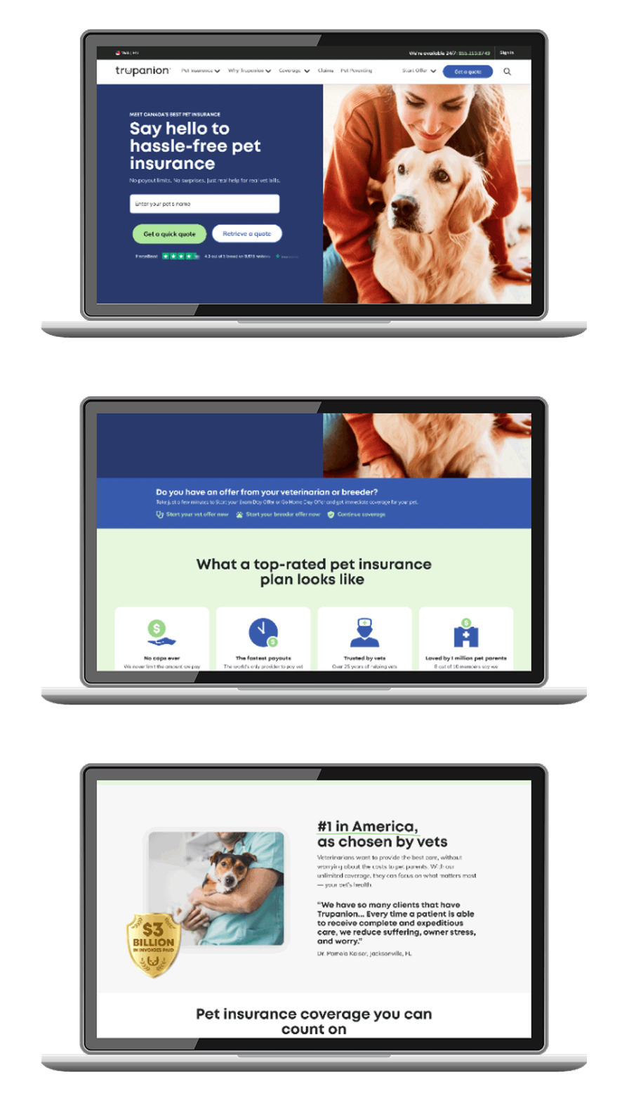
The problem
The original homepage was trying to do too much. An overloaded hero with multiple CTAs, an interrupting promo banner, and unclear messaging hierarchy created a confusing experience. 85% of visitors never scrolled past the fold. Only 7.5% clicked through to get a quote.
More fundamentally, the approach was backwards — visitors were being hit with features and price comparisons first, when what actually drives pet insurance decisions is emotional. Pet owners don't start by asking "what's the cheapest option?" They start by asking "how do I make sure my pet gets the care it needs?"
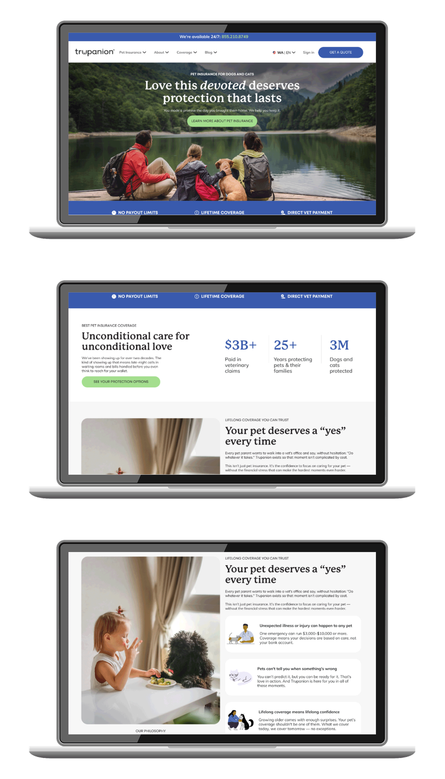
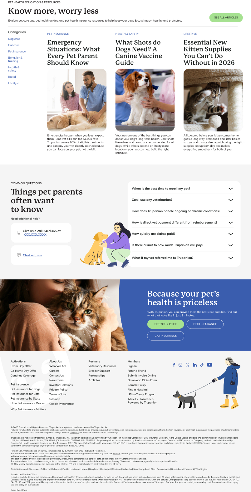
A key part of the redesign was stripping back the design language to match Trupanion's refined brand identity. The old site felt cluttered and overly promotional. The new approach uses intentional hierarchy, breathing room, and clear visual storytelling to make the page feel trustworthy and accessible rather than salesy.
The shift
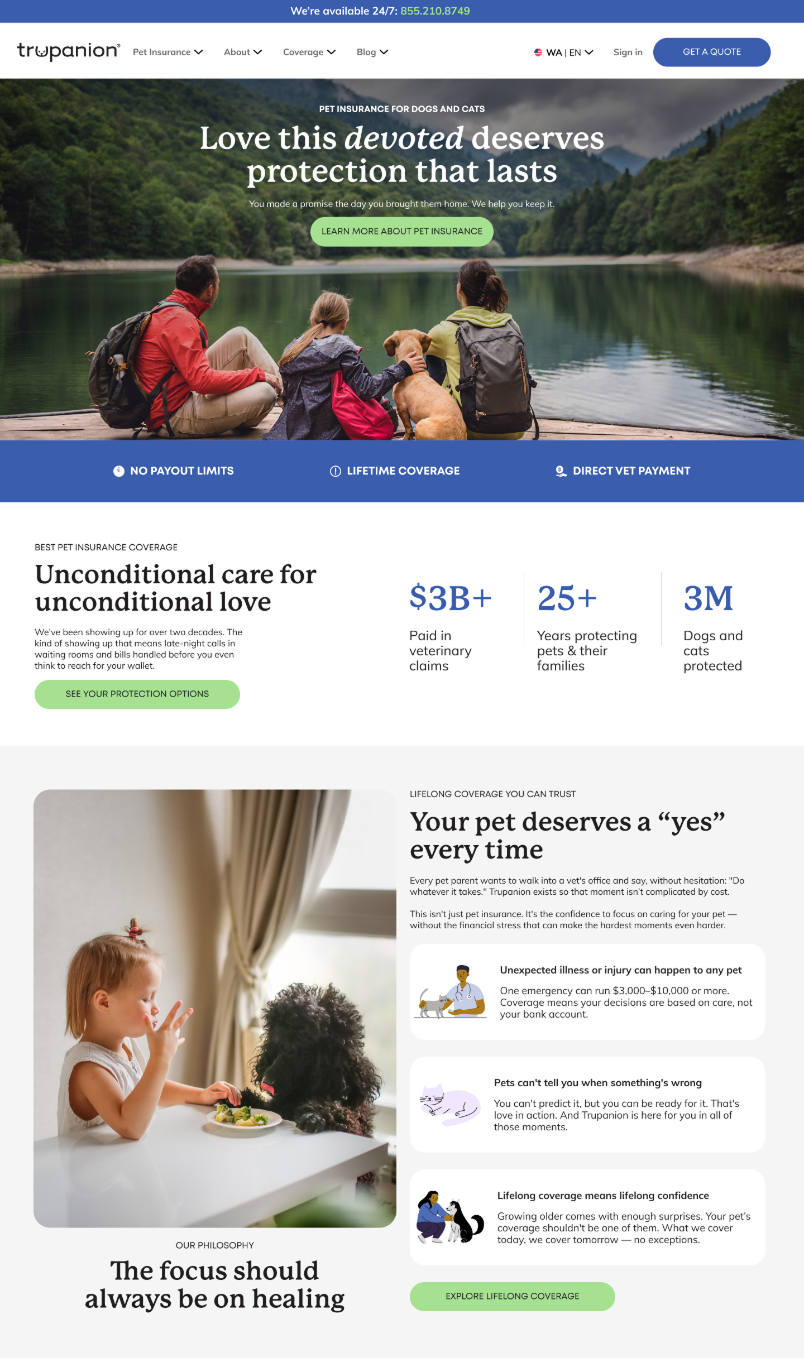
We completely reframed the messaging around the pet-owner relationship. The new homepage leads with emotional storytelling and real-world scenarios — showing what it means to have your pet protected — before jumping into Trupanion's benefits or asking for a quote.
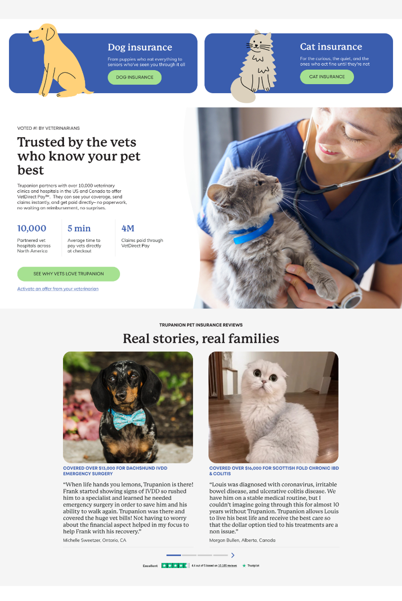
Visually, we simplified: cleaner layouts, generous white space, real pet imagery that shows joy and connection rather than just product features. The copy shifted from "here's what we offer" to "here's why this matters." We also restructured navigation and calls-to-action so the page naturally guides visitors deeper into education (dog/cat insurance pages, coverage details, why Trupanion) rather than pushing them straight to quote.
Results & rollout
Quote rates and enrollment numbers are already up in the short time since launch. We're rolling out the remaining pages (dog insurance, cat insurance, coverage details) monthly, prioritizing by engagement and conversion data as we move.
The approach is validating — when you lead with emotion and education instead of price, people engage deeper with the page and move through the funnel with more confidence.